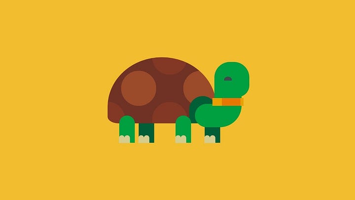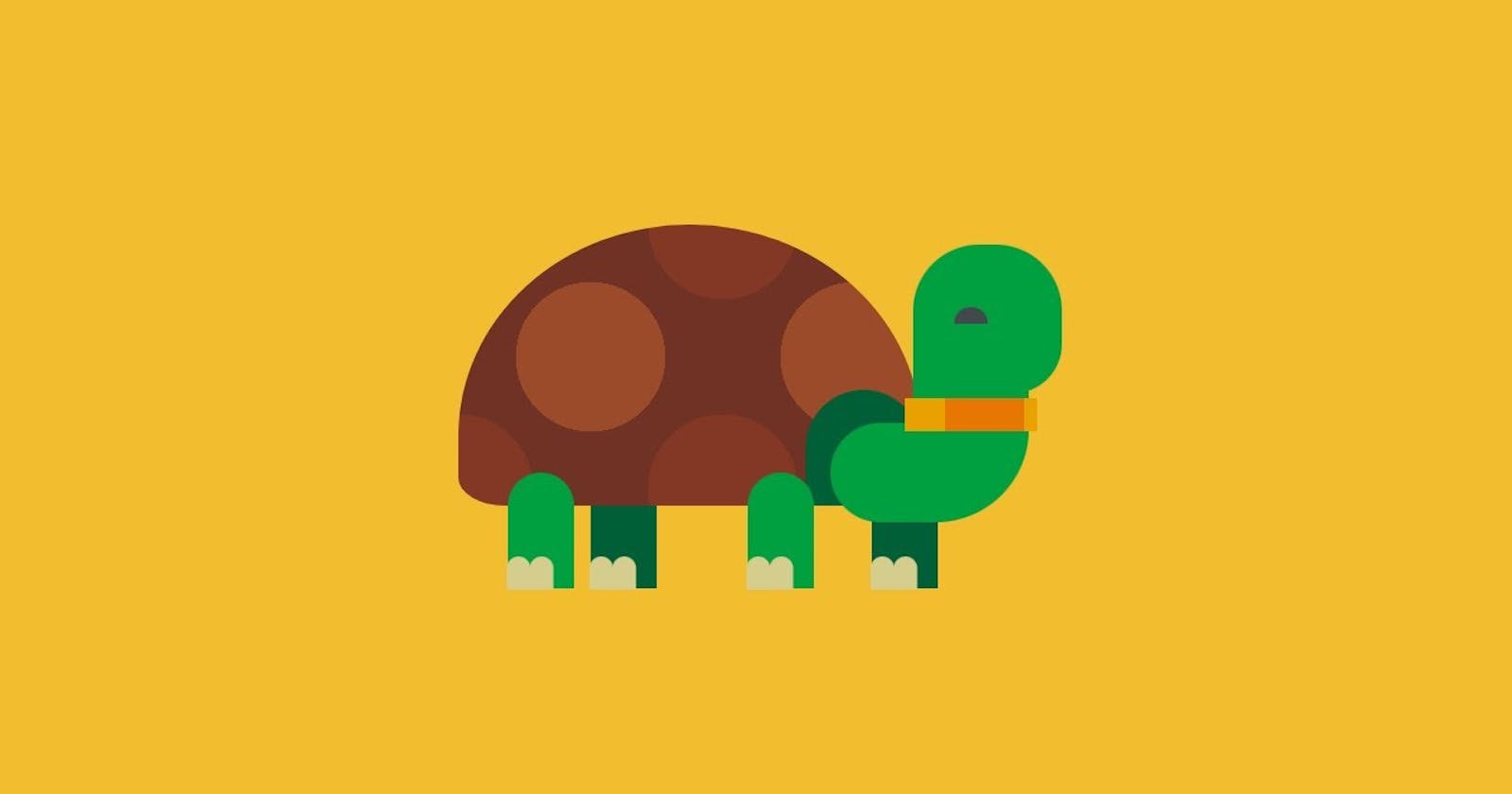
Hey everyone. Welcome to today’s tutorial. In today’s tutorial, we will learn how to create a CSS-based ‘Tortoise’. To build this project we would need HTML and CSS. Let’s discover how to build this project in a few simple and easy-to-follow steps.
Video Tutorial:
If you are interested to learn by watching a video tutorial rather than reading a blog post you can check out the video down below. Also, subscribe to my YouTube channel where I post new tutorials every alternate day.
Project Folder Structure:
Let’s build the project folder structure before we begin writing the code. We create a project folder called ‘CSS Tortoise’. Inside this folder, we have two files named index.html and style.css.
HTML:
We begin with the HTML Code. Create a file called — ‘index.html’ and paste the code given below. We start by creating the container div, which has div elements for the legs and the shell. The shell has div elements for the neck, belt, and eyes.
<!DOCTYPE html>
<html lang="en">
  <head>
    <meta name="viewport" content="width=device-width, initial-scale=1.0" />
    <title>CSS Tortoise</title>
    <!-- Stylesheet -->
    <link rel="stylesheet" href="style.css" />
  </head>
  <body>
    <div class="container">
      <div class="leg leg-3"></div>
      <div class="leg leg-4"></div>
      <div class="shell">
        <div class="neck"></div>
        <div class="belt"></div>
        <div class="eye"></div>
      </div>
      <div class="leg leg-1"></div>
      <div class="leg leg-2"></div>
    </div>
  </body>
</html>
CSS:
Next, we style our tortoise using CSS. For this copy, the code provided to you below and paste it into your stylesheet.
Our first focus would be on creating the shell. We need light spots on the dark-colored shell for which we use the ‘radial-gradient’ property to set ‘background-image’. Then we set alignment, size, and ‘border-radius’ to generate a curved shell. Further, we use the ‘before’ pseudo-element to create the shell opening. Then for creating the neck, we place the common code in the ‘neck’ div, for creating the upper and bottom parts we use the ‘before’ and ‘after’ pseudo-elements. After this, we create the belt and provide a background using the ‘linear-gradient’ property.
After creating the shell let’s focus on the legs of our tortoise, the legs share a similar code, the only important part is to align them properly. Each leg has nails that are created using the ‘before’ pseudo-element. Finally, we create the eye using ‘border-radius’ and properly align it on the face.
* {
  padding: 0;
  margin: 0;
  box-sizing: border-box;
}
body {
  background-color: #f2bd2f;
}
.container {
  height: 31.25em;
  width: 31.25em;
  position: absolute;
  transform: translate(-50%, -50%);
  top: 50%;
  left: 50%;
}
.shell {
  position: absolute;
  height: 10.62em;
  width: 17.5em;
  background-image: radial-gradient(#9b4a2a 40%, transparent 40%),
    radial-gradient(#833825 40%, transparent 40%);
  background-color: #703225;
  background-position: 0 0, 5em 5em;
  background-size: 10em 10em;
  border-radius: 50% 50% 10% 10%/75% 75% 10% 10%;
  top: 9.37em;
  left: 4.37em;
}
.shell:before {
  position: absolute;
  content: "";
  height: 4.37em;
  width: 4.37em;
  background-color: #005f37;
  border-radius: 4.37em 4.37em 0 0;
  bottom: 0;
  right: 0;
}
.neck {
  height: 3.75em;
  width: 7.5em;
  background-color: #009f40;
  border-radius: 5em 0 9.37em 5em;
  position: absolute;
  left: 14.06em;
  top: 7.5em;
}
.neck:before {
  content: "";
  position: absolute;
  height: 1.25em;
  width: 4.37em;
  background-color: #009f40;
  top: -1.18em;
  left: 3.12em;
}
.neck:after {
  content: "";
  position: absolute;
  height: 5.62em;
  width: 5.62em;
  background-color: #009f40;
  bottom: 4.87em;
  left: 3.12em;
  border-radius: 2.5em 2.5em 1.87em 0;
}
.belt {
  background: linear-gradient(
    to right,
    #e9a100 30%,
    #e77702 30%,
    #e77702 90%,
    #e9a100 90%
  );
  height: 1.25em;
  width: 5em;
  position: absolute;
  top: 6.56em;
  left: 16.87em;
}
.leg {
  background-color: #009f40;
  height: 4.37em;
  width: 2.5em;
  position: absolute;
  border-radius: 1.25em 1.25em 0 0;
  top: 18.75em;
}
.leg:before {
  content: "";
  height: 1.25em;
  width: 0.93em;
  position: absolute;
  background-color: #d5cd8e;
  bottom: -0.06em;
  left: -0.06em;
  border-radius: 0.62em 0.62em 0 0;
  box-shadow: 0.87em 0 #d5cd8e;
}
.leg-1 {
  left: 6.25em;
}
.leg-2 {
  left: 15.31em;
}
.leg-3 {
  background-color: #005f37;
  left: 9.37em;
}
.leg-4 {
  background-color: #005f37;
  left: 20em;
}
.eye {
  position: absolute;
  background-color: #43484d;
  height: 0.62em;
  width: 1.25em;
  border-radius: 0.62em 0.62em 0 0;
  top: 3.12em;
  left: 18.75em;
}
@media screen and (min-width: 800px) {
  .container {
    font-size: 1.4em;
  }
}
That’s all for this tutorial. If you face any issues while creating this code you can download the source code by clicking on the ‘Download Code’ button below. Now all you have to do is extract the files from the zipped folder.
