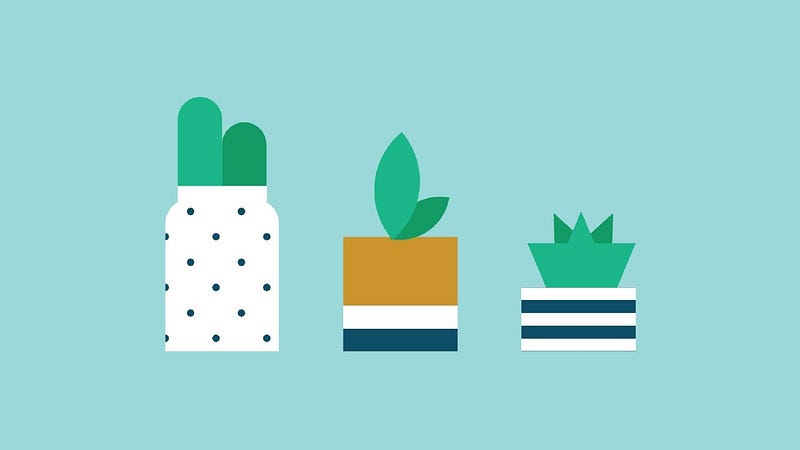
Hey everyone. Welcome to today’s tutorial. In today’s tutorial, we will learn how to create a responsive illustration. To create this illustration we need HTML and CSS. This tutorial is especially for beginners.
If you are looking for more complex tutorials. You can check out this playlist here. This playlist consists of a bunch of tutorials that will help you learn CSS art and illustrations.
Even though these drawings have no application in real-world projects. These projects are a great way to learn and explore CSS animations.
In this project, we create three potted plants. We explore background-image, gradients, transforms, border-radius, borders etc.
Video Tutorial:
If you are interested to learn through video tutorials rather than reading this blog post you can check out the video down below. Also, subscribe to my YouTube channel where I post new tips tricks and tutorials every alternate day. Along with this tutorial, I also post multiple-choice questions based on HTML CSS and JavaScript. These multiple-choice questions will help you with your interviews
Project Folder Structure:
Before we start coding let us take a look at the project folder structure. Create a project folder, called-‘Plants Art’. Inside this folder, we have two files. These files are index.html and style.css. The first file is the HTML document and the second one is the stylesheet.
HTML:
We first code the HTML. Now copy the code below and paste it into your HTML document.
<!DOCTYPE html>
<html lang="en">
  <head>
    <meta name="viewport" content="width=device-width, initial-scale=1.0" />
    <title>Plants Art</title>
    <!-- Stylesheet-->
    <link rel="stylesheet" href="style.css" />
  </head>
  <body>
    <div class="container">
      <div class="plant-1">
        <div class="succulent-1"></div>
      </div>
      <div class="plant-2"><div class="succulent-2"></div></div>
      <div class="plant-3">
        <div class="succulent-3"></div>
        <div class="succulent-4"></div>
      </div>
    </div>
  </body>
</html>
CSS:
Next, we code the CSS part. For this paste, the code provided to you below and paste your stylesheet.
That’s it for this tutorial. Potted plants art is now ready. You can now go ahead and customise it the way you want. You can do this by changing colours, dimensions etc.
* {
  padding: 0;
  margin: 0;
  box-sizing: border-box;
}
body {
  background-color: #9bd8da;
}
.container {
  height: 18.75em;
  width: 26.25em;
  position: absolute;
  transform: translate(-50%, -50%);
  left: 50%;
  top: 50%;
}
.plant-1 {
  position: absolute;
  background-image: radial-gradient(#0e4d66 0.18em, transparent 0.18em),
    radial-gradient(#0e4d66 0.18em, #feffff 0.18em);
  background-size: 2.5em 2.5em;
  background-position: 0 -0.62em, 1.25em 0.62em;
  height: 7.5em;
  width: 5.6em;
  border-radius: 1.25em 1.25em 0 0;
  bottom: 1.87em;
  left: 1.25em;
}
.plant-1:before {
  position: absolute;
  content: "";
  background-color: #feffff;
  width: 4.37em;
  height: 0.75em;
  left: 0.62em;
  top: -0.62em;
}
.succulent-1 {
  position: absolute;
  background-color: #1bb68a;
  height: 4.37em;
  width: 2.18em;
  left: 0.62em;
  top: -5em;
  border-radius: 1.87em 1.87em 0 0;
}
.succulent-1:before {
  position: absolute;
  content: "";
  background-color: #139b66;
  height: 3.12em;
  width: 2.18em;
  top: 1.25em;
  left: 2.18em;
  border-radius: 1.87em 1.87em 0 0;
}
.plant-2 {
  position: absolute;
  height: 5.62em;
  width: 5.62em;
  background: linear-gradient(
    #cc942c 60%,
    #ffffff 60%,
    #ffffff 80%,
    #0d4d65 80%
  );
  bottom: 1.87em;
  left: 10em;
}
.succulent-2 {
  position: absolute;
  height: 2.5em;
  width: 2.5em;
  background-color: #138b66;
  border-radius: 2.5em 0;
  top: -2.18em;
  left: 2.5em;
  transform: rotate(10deg);
}
.succulent-2:before {
  content: "";
  position: absolute;
  height: 3.75em;
  width: 3.75em;
  background-color: #1bb68a;
  border-radius: 3.75em 0;
  bottom: 0.75em;
  left: -2em;
  transform: rotate(-50deg);
}
.plant-3 {
  position: absolute;
  height: 3.12em;
  width: 5.62em;
  background-image: linear-gradient(0deg, #feffff 50%, #0e4d66 50%);
  background-size: 0.87em 1.25em;
  bottom: 1.87em;
  left: 18.75em;
}
.succulent-4 {
  position: absolute;
  height: 0;
  width: 5.31em;
  border-top: 2.18em solid #1bb68a;
  border-left: 0.93em solid transparent;
  border-right: 0.93em solid transparent;
  bottom: 3.12em;
  left: 0.31em;
}
.succulent-4:before {
  position: absolute;
  content: "";
  height: 0;
  width: 0;
  border-bottom: 2.18em solid #138b66;
  border-left: 0.93em solid transparent;
  border-right: 0.93em solid transparent;
  bottom: 2.2em;
  left: 0.75em;
}
.succulent-3:before {
  position: absolute;
  content: "";
  height: 0;
  width: 0;
  border-bottom: 2.18em solid #139b66;
  border-left: 0.93em solid transparent;
  border-right: 0.93em solid transparent;
  bottom: 4.68em;
  left: 3.12em;
  transform: rotate(25deg);
}
.succulent-3:after {
  position: absolute;
  content: "";
  height: 0;
  width: 0;
  border-bottom: 2.18em solid #139b66;
  border-left: 0.93em solid transparent;
  border-right: 0.93em solid transparent;
  bottom: 4.68em;
  right: 2.62em;
  transform: rotate(-25deg);
}
@media screen and (min-width: 700px) {
  .container {
    font-size: 1.5em;
  }
}
If you face any issues while creating this code you can download the source code by clicking on the download button below. Also, If you have any queries, suggestions, or feedback you can comment on them below.
Happy coding
Other Tutorial:
