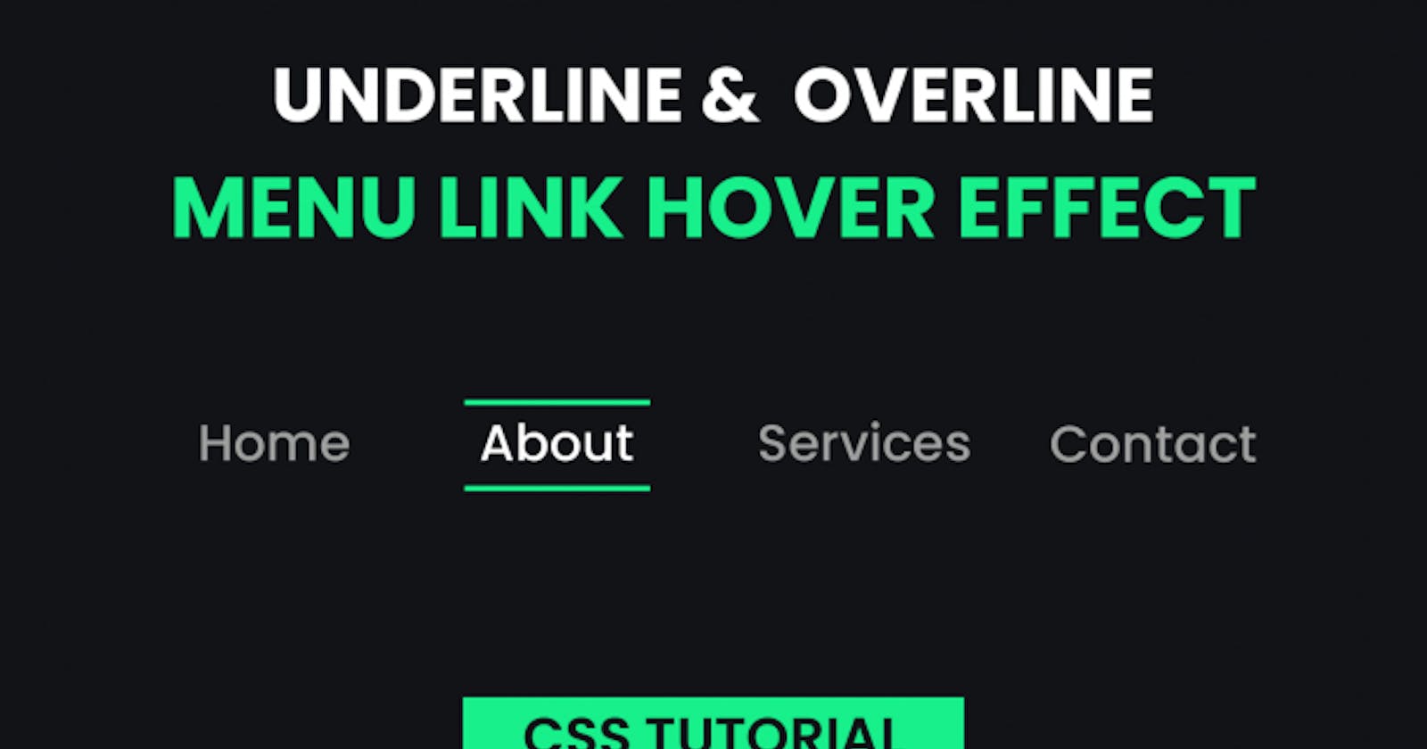
Hey everyone. Welcome to today’s tutorial. In this tutorial, we will learn how to create a simple yet captivating link hover effect. To create this effect, we need HTML and pure CSS. Not only this tutorial is super quick it is also easy and beginner-friendly.
I have a playlist on other styles of menu link hover effects. You can check them in this playlist here.
If you want to support my channel and see more great content, hit that subscribe button.😍
Video Tutorial:
If you prefer to learn by watching a video tutorial rather than reading the blog post, check out this video down below. I post lots of such video tutorials regularly on my youtube channel. Be sure to subscribe, so you don’t miss out on any of these useful tutorials.
Project Folder Structure:
Let us start by creating the project folder structure. We name the project folder — ‘Menu Link Hover Effect’. Inside this folder, we have two files — index.html and style.css. Here, index.html is our HTML document and, style.css is our stylesheet.
HTML:
We start with the HTML section. The HTML code consists of a Nav element. Inside this Nav element, we have four anchor tags. The ‘href’ attribute of each of these anchor tags is the section/page they are linked to. You can use any URLs of your choice.
<!DOCTYPE html>
<html lang="en">
  <head>
    <meta name="viewport" content="width=device-width, initial-scale=1.0" />
    <title>Menu Link Hover Effect</title>
    <!-- Google Font -->
    <link
      href="https://fonts.googleapis.com/css2?family=Poppins:wght@500&display=swap"
      rel="stylesheet"
    />
    <!-- Stylesheet -->
    <link rel="stylesheet" href="style.css" />
  </head>
  <body>
    <nav>
      <a href="#home">Home</a>
      <a href="#about">About</a>
      <a href="#services">Services</a>
      <a href="#contact">Contact</a>
    </nav>
  </body>
</html>
CSS:
Next, we style and add a hover effect to these links. For this we need CSS.
We start by removing margins and paddings from all the elements. Also, we set the box-sizing of each element to the ‘border-box’.
In the next step, we set a background color for the body and set dimensions for the nav. We then center and space the contents of the Nav using the flex layout.
Now for the ‘a’ tag, we set the position to relative and text-decoration to none. We further style the typography and add a right and left padding of 10px.
Next, we set the height of ‘a: before’ and ‘a: after’ pseudo-elements to 0. Initially, we set the width of each of them to 0. However, on hover the width changes to 100%. As we set the left property of ‘a:after’ to 0, it appears to be growing from the left side. On the other the ‘a:before’ appears to be growing from the right side.
*,
*:before,
*:after {
  padding: 0;
  margin: 0;
  box-sizing: border-box;
}
body {
  background-color: #121317;
}
nav {
  height: 100vh;
  width: 70vw;
  min-width: 600px;
  display: flex;
  align-items: center;
  justify-content: space-around;
  margin: auto;
}
a {
  position: relative;
  text-decoration: none;
  font-family: "Poppins", sans-serif;
  color: #a0a0a0;
  font-size: 18px;
  letter-spacing: 0.5px;
  padding: 0 10px;
}
a:before,
a:after {
  content: "";
  position: absolute;
  height: 3px;
  width: 0;
  background-color: #18f08b;
  transition: 0.5s;
}
a:after {
  left: 0;
  bottom: -10px;
}
a:before {
  right: 0;
  top: -10px;
}
a:hover {
  color: #ffffff;
}
a:hover:after,
a:hover:before {
  width: 100%;
}
Our link hover is finally ready. If you have any issues while creating this, you can download the source code by clicking on the download button below. Also don’t forget to drop your queries, suggestions and feedback in the comments below.
